2009 car launches thread
Posted by flat tyre
| Registered: 20 years ago |
| Registered: 20 years ago |

| Registered: 15 years ago |

| Moderator Registered: 20 years ago |
But the back of the sidepods look SO much better, than cannot be denied.

K*bots UK, specialist providers of 'fun science' Curriculum Enhancement days for Primary and Secondary schools in Britain.
Please find us on [en.wikipedia.org] for more information.
| Registered: 20 years ago |
| Registered: 18 years ago |
| Registered: 20 years ago |
| Registered: 16 years ago |
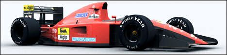
erhmm,hope they ban those ugly sharkfines,winglets and all other annoying things attached to that car,i thought i could see a basic simple shape this year,but i was wrong. HUHUHUHUH 
2 Hot 2 Handle.
MS-
KR -
"You must always pick the worst car and the worst team on the grid, to be the best."
—Fangio
2 Hot 2 Handle.
MS-
KR -
"You must always pick the worst car and the worst team on the grid, to be the best."
—Fangio
| Registered: 19 years ago |
loque schreef:
-------------------------------------------------------
> toyota has sort of platey things sticking out the
> side pods.
> surely, that's not allowed?
if it wasnt allowed why would they put it on the car. It was there already at the launch, ferrari has some samer sort of wing, but then with a mirror on it.
| Registered: 20 years ago |
")
| Registered: 19 years ago |
| Registered: 19 years ago |

| Registered: 19 years ago |
yes, last year's was ok, but this year's looks dreadful so far...
btw, the toyota is looking better and better all the time!


X (@ed24f1)
btw, the toyota is looking better and better all the time!
X (@ed24f1)
| Registered: 20 years ago |
I don't like the look of the new cars, honestly, but we will get use it soon. They do not look worse than the 80's cars or mid 90s.
The worse thing is that all of them are similar this time, new rules give less room to aero innovations so they all look the same.
Edited 1 time(s). Last edit at 01/19/2009 09:14AM by Ali.
The worse thing is that all of them are similar this time, new rules give less room to aero innovations so they all look the same.
Edited 1 time(s). Last edit at 01/19/2009 09:14AM by Ali.
| Registered: 17 years ago |


| Registered: 20 years ago |
| Registered: 19 years ago |

-=-=-=-=-=-=-=-=-=-=-=-=-=-=-=-=-=-=-=-=-=-=-=-=-=-=-=-=-=-=-=-=-=-
theRacingLine.net
SportsCarArchives.com
| Registered: 20 years ago |
Wow. That's certainly different...
Like (like isn't really the right word...... hate) how they've essentially draped it in a Spanish flag. But I'm sure Mr. Alonso will be happy with that. :P
It just looks odd. General shape seems fairly standard, but it's got some rather new bits to it... very, very flat at the rear, and the nose too.
| Registered: 19 years ago |
As a livery, it is just a mess. There is always an orange border between the white and yellow, to seperate them, except on the front nose, where it has a clash. The blue ING logo doesn't fit, and the black Renault logo doesn't fit. The Red Total stuff doesn't fit. The rear wing has too much yellow, and the front wing has too much white.
All of this before you notice that the front nose is essentially a box.
It looks like it was designed by a random dude painting cars for games online. Renault have taken the worst livery on the grid, and made it worse.
-=-=-=-=-=-=-=-=-=-=-=-=-=-=-=-=-=-=-=-=-=-=-=-=-=-=-=-=-=-=-=-=-=-
theRacingLine.net
SportsCarArchives.com


Sorry, only registered users may post in this forum.
GP3 CarshapesGP3 CART & other CarsGP3 CART & other TracksGP3 CockpitsGP3 Editors / UtilitiesGP3 F1 CarsGP3 F1 TracksGP3 Fictional CarsGP3 Fictional TracksGP3 Graphics (Software Mode)GP3 HelmetsGP3 MiscGP3 Misc. GraphicsGP3 PatchesGP3 PitcrewsGP3 Season PackagesGP3 SetupsGP3 SoundsGP3 TeamartGP3 Trackgraphics
Maintainer: mortal, stephan | Design: stephan, Lo2k | Moderatoren: mortal, TomMK, Noog, stephan | Downloads: Lo2k | Supported by: Atlassian Experts Berlin | Forum Rules | Policy