midland-toyota 2006 released page 2
Posted by vasstek
| Registered: 18 years ago |
hi friends!
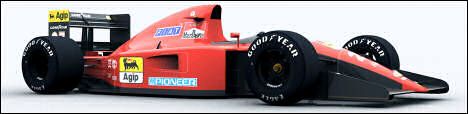
i modified the teraur´s ej15 for make the new midland for this season
i have his permison for make it")
all the tex are painted by me and the aerodinamic modifications, are make it bu me
except the rear fins that make it E_shumi "the wizard" jeje
i hope that like you, it´s go to go released when barhein´s race it´s finished
renders:


ingame screens:


photoshop screenshots:


Edited 1 time(s). Last edit at 03/13/2006 12:09AM by vasstek.
i modified the teraur´s ej15 for make the new midland for this season
i have his permison for make it
all the tex are painted by me and the aerodinamic modifications, are make it bu me
except the rear fins that make it E_shumi "the wizard" jeje
i hope that like you, it´s go to go released when barhein´s race it´s finished
renders:


ingame screens:


photoshop screenshots:


Edited 1 time(s). Last edit at 03/13/2006 12:09AM by vasstek.
| Registered: 20 years ago |
")
| Registered: 18 years ago |
| Registered: 20 years ago |
| Registered: 18 years ago |

| Registered: 19 years ago |
good work
===================================================================================================================
i7 950@4GHZ 1.24V|Asus P6X58D-E|Dominators 10GB(2GBx5)1600C8|Corsair H70|Corsair 800D|Corsair HX850|EVGA,Zotac GTX 2x470|VX2433W FULL HD|X-Fi Plantinum|Creative S750 Gigaworks7.1|NZXT Sentry 2|7TB
| Registered: 19 years ago |


| Registered: 18 years ago |
| Registered: 19 years ago |
| Registered: 20 years ago |
| Registered: 18 years ago |
thanks for the coments, i will try to fix it,
respect to the rhino´s logo, i painted with an old screens and put the logos how this.... for this i say that i will release when barhein´s race be finished
@stan: i see that your post only are critices never put works....if you put any job anyday, i will go to be very critice with you.i will go to see to the milimeters. for what you say "deformed"?? i dont see deformed, maybe wide, but i make the better that i know.....
for you, all the job that aren´t maked by the "big" shapers and painted are bad...i dont understand this....
it´s only my opinion...
| Registered: 19 years ago |

| Registered: 19 years ago |
vasstek Wrote:
-------------------------------------------------------
> thanks for the coments, i will try to fix it,
>
> respect to the rhino´s logo, i painted with an old
> screens and put the logos how this.... for this i
> say that i will release when barhein´s race be
> finished
>
> @stan: i see that your post only are critices
> never put works....if you put any job anyday, i
> will go to be very critice with you.i will go to
> see to the milimeters. for what you say
> "deformed"?? i dont see deformed, maybe wide, but
> i make the better that i know.....
>
> for you, all the job that aren´t maked by the
> "big" shapers and painted are bad...i dont
> understand this....
>
lso > it´s only my opinion...
>
problem is that he is right though.
the nose is too wide and deformed, the bottom of the nose should make a much sharper "point" with the nose nose and the nose is extremely wide which you have accepted, the modelling at the bottom of the nose is completely wrong IMO.
the curve is much more "pronouced" [that the word?] than you have modelled.
the position of those wings on the sidepod is also wrong.
the front wing support should also be larger.
i could go on but cba at the moment
[img336.imageshack.us]
see that pic as a reference
Edited 1 time(s). Last edit at 03/10/2006 12:28AM by Mini Maestro.
| Registered: 18 years ago |
| Registered: 18 years ago |

| Registered: 19 years ago |

| Registered: 18 years ago |
| Registered: 19 years ago |
Well I think nose is perfect now. God job mate!
____________________________________________
[webberfanscreens.blogspot.com]
____________________________________________
[webberfanscreens.blogspot.com]
| Registered: 18 years ago |


| Registered: 20 years ago |
i think this pics will help you:
[f1.racing-live.com]
[f1.racing-live.com]
[f1.racing-live.com]
[f1.racing-live.com]
[f1.racing-live.com]
[f1.racing-live.com]
[f1.racing-live.com]
[f1.racing-live.com]
[f1.racing-live.com]
================================================
| Athlon XP 3200+ @ 2.8ghz | 1024mb Ram DDR 400 Kingston | Geforce 6600GT XFX ViVo | ASUS A7N8X-X | HD 80gb Maxtor | SevenTeam 350w | LCD LG 17'| Genius Force Feedback Speed Wheel |


[f1.racing-live.com]
[f1.racing-live.com]
[f1.racing-live.com]
[f1.racing-live.com]
[f1.racing-live.com]
[f1.racing-live.com]
[f1.racing-live.com]
[f1.racing-live.com]
[f1.racing-live.com]
================================================

Sorry, only registered users may post in this forum.
GP3 CarshapesGP3 CART & other CarsGP3 CART & other TracksGP3 CockpitsGP3 Editors / UtilitiesGP3 F1 CarsGP3 F1 TracksGP3 Fictional CarsGP3 Fictional TracksGP3 Graphics (Software Mode)GP3 HelmetsGP3 MiscGP3 Misc. GraphicsGP3 PatchesGP3 PitcrewsGP3 Season PackagesGP3 SetupsGP3 SoundsGP3 TeamartGP3 Trackgraphics
Maintainer: mortal, stephan | Design: stephan, Lo2k | Moderatoren: mortal, TomMK, Noog, stephan | Downloads: Lo2k | Supported by: Atlassian Experts Berlin | Forum Rules | Policy