GPGSL S8 Round 14 -Monaco Grand Prix - The RD's Short Straw >> SHOCKING NEWS AT PAGE 204!!! <<
Posted by GPGSL
Re: GPGSL S8 Round 11 - A1-Ring - Austrian Grand Prix - so call me, maybe. Date: April 30, 2013 04:47PM Posted by: Incident 2k9 | Registered: 15 years ago |
Mullet345 Wrote:
-------------------------------------------------------
> @Ferrari2007, I'll take that into consideration.
> But how many sponsors should I look at having? I
> need 4 sponsors: Fuel, Tyres, Engine and Main. So
> how many on top of that? And would there be any
> conflict between any of the sponsors currently on
> the car?
There would probably be some conflict between Monster and Pepsi.
A couple more little points, perhaps reduce the size of the Sonax front wing logos a little just to make it look a little cleaner, and the Merc logo on the nose cone whilst switching SAP and Pirelli around just so the sponsors fit to the dimensions of the car more naturally. If you follow the shape of the car, it'll look tidier in my opinion.
GPGSL: S6 - TafuroGP Tester (14th) /// S7 - ART Tester (6th) /// S8 - Demon Driver (13th) /// S9 - Demon/Snake Driver (13th) /// S10 - Snake Driver (???) ///]
"My ambition is handicapped by laziness" - Charles Bukowski
Re: GPGSL S8 Round 11 - A1-Ring - Austrian Grand Prix - so call me, maybe. Date: April 30, 2013 05:41PM Posted by: truecrysis | Registered: 14 years ago |
For me a livery should either be simple with effective use of colours and lines like AMR, TSM, Christel, Scuderia, SCR, MAC and Demon or have something that makes it stand out as spectacular as with One, Snake, TNR and MPR. For me the tyrant livery sits in the middle and so doesn't stick out as either. As Dan said sometimes less is more and with less sponsors as well as perhaps tweaking the colours and the lines so they fit together naturally it could look very good. Either that or tweak the livery to try and give it something that really stands out from all the other cars on the grid, and then fit sponsors on the livery to compliment the design.
I'm not saying the livery is awful of course! It's a good start definitely, and gives you somewhere to push off from with changes.
_________________________________________________
For a list of EVERY download for GP4, look here: [docs.google.com]
Edited 1 time(s). Last edit at 04/30/2013 05:42PM by truecrysis.
Re: GPGSL S8 Round 11 - A1-Ring - Austrian Grand Prix - so call me, maybe. Date: April 30, 2013 05:44PM Posted by: Incident 2k9 | Registered: 15 years ago |
I'm so, so, tempted to show off my potential livery (just so nobody treads on my toes with the white/dark grey colour scheme), but at the same time I wanna keep it under wraps...
I'll give you all a little clue with it though...it has quite an interesting feature on the grey.
GPGSL: S6 - TafuroGP Tester (14th) /// S7 - ART Tester (6th) /// S8 - Demon Driver (13th) /// S9 - Demon/Snake Driver (13th) /// S10 - Snake Driver (???) ///]
"My ambition is handicapped by laziness" - Charles Bukowski
Re: GPGSL S8 Round 11 - A1-Ring - Austrian Grand Prix - so call me, maybe. Date: April 30, 2013 05:59PM Posted by: kedy89 | Registered: 13 years ago |
Incident 2k9 schrieb:
-------------------------------------------------------
> I'm so, so, tempted to show off my potential
> livery (just so nobody treads on my toes with the
> white/dark grey colour scheme), but at the same
> time I wanna keep it under wraps...
>
> I'll give you all a little clue with it
> though...it has quite an interesting feature on
> the grey.
50 shades?")

Some mods
F1 1996 | F1 2002 | F1 2007 | F1 2011 | F1 2013 | F1 2015 | F1 2018
-------------------------------------------------------
> I'm so, so, tempted to show off my potential
> livery (just so nobody treads on my toes with the
> white/dark grey colour scheme), but at the same
> time I wanna keep it under wraps...
>
> I'll give you all a little clue with it
> though...it has quite an interesting feature on
> the grey.
50 shades?
Some mods
F1 1996 | F1 2002 | F1 2007 | F1 2011 | F1 2013 | F1 2015 | F1 2018
Re: GPGSL S8 Round 11 - A1-Ring - Austrian Grand Prix - so call me, maybe. Date: April 30, 2013 06:08PM Posted by: Incident 2k9 | Registered: 15 years ago |
kedy89 Wrote:
-------------------------------------------------------
> Incident 2k9 schrieb:
> --------------------------------------------------
> -----
> > I'm so, so, tempted to show off my potential
> > livery (just so nobody treads on my toes with
> the
> > white/dark grey colour scheme), but at the same
> > time I wanna keep it under wraps...
> >
> > I'll give you all a little clue with it
> > though...it has quite an interesting feature on
> > the grey.
>
>
> 50 shades?
Touché! I'm afraid not though, it's a bit more...subtle.
Screw it, I'll show y'all what I've made (feedback most certainly welcome):

GPGSL: S6 - TafuroGP Tester (14th) /// S7 - ART Tester (6th) /// S8 - Demon Driver (13th) /// S9 - Demon/Snake Driver (13th) /// S10 - Snake Driver (???) ///]
"My ambition is handicapped by laziness" - Charles Bukowski
-------------------------------------------------------
> Incident 2k9 schrieb:
> --------------------------------------------------
> -----
> > I'm so, so, tempted to show off my potential
> > livery (just so nobody treads on my toes with
> the
> > white/dark grey colour scheme), but at the same
> > time I wanna keep it under wraps...
> >
> > I'll give you all a little clue with it
> > though...it has quite an interesting feature on
> > the grey.
>
>
> 50 shades?
Touché! I'm afraid not though, it's a bit more...subtle.
Screw it, I'll show y'all what I've made (feedback most certainly welcome):
GPGSL: S6 - TafuroGP Tester (14th) /// S7 - ART Tester (6th) /// S8 - Demon Driver (13th) /// S9 - Demon/Snake Driver (13th) /// S10 - Snake Driver (???) ///]
"My ambition is handicapped by laziness" - Charles Bukowski
Re: GPGSL S8 Round 11 - A1-Ring - Austrian Grand Prix - so call me, maybe. Date: April 30, 2013 06:53PM Posted by: kedy89 | Registered: 13 years ago |
")
Re: GPGSL S8 Round 11 - A1-Ring - Austrian Grand Prix - so call me, maybe. Date: April 30, 2013 09:49PM Posted by: Ferrari2007 | Registered: 17 years ago |
That's very cool Jake.
Please please please put some sort of nose art on the side though. Like a red croc's nose, something like the Jordan cars had in the late 90s/early 2000s.
That'd look so badass.
Greg, I'd potentially drop Mastercard and Pepsi as sponsors. You could then be principally supported by Monster, Prince and Sonax, with fuel provided by Shell and engines and tyres by Mercedes and Pirelli respectively.
I think cutting down the number of sponsors will just leave your livery less cluttered. For instance it would mean that you'd have a lot more space for the SAP, Pirelli, and Mercedes logo on the nose, and could experiment with the rear wing endplates.
One thing I would definitely suggest is to remove the Merc logo off of the front wing supports. Just check out some of the other liveries from this season and you'll notice we've all tended to steer away from putting logo's there.
A final point on your fuel and engine partners, I'm pretty sure that Shell exclusively provide fuel for Ferrari, so I'm not sure if they would actually work alongside Mercedes.
Obviously it's a game at the end of the day, so stuff like that doesn't really matter.

Races: 163 - Wins: 23 - Pole Positions: 24 - Fastest Laps: 22
Season 9: Constructors' Champions
Please please please put some sort of nose art on the side though. Like a red croc's nose, something like the Jordan cars had in the late 90s/early 2000s.
That'd look so badass.
Greg, I'd potentially drop Mastercard and Pepsi as sponsors. You could then be principally supported by Monster, Prince and Sonax, with fuel provided by Shell and engines and tyres by Mercedes and Pirelli respectively.
I think cutting down the number of sponsors will just leave your livery less cluttered. For instance it would mean that you'd have a lot more space for the SAP, Pirelli, and Mercedes logo on the nose, and could experiment with the rear wing endplates.
One thing I would definitely suggest is to remove the Merc logo off of the front wing supports. Just check out some of the other liveries from this season and you'll notice we've all tended to steer away from putting logo's there.
A final point on your fuel and engine partners, I'm pretty sure that Shell exclusively provide fuel for Ferrari, so I'm not sure if they would actually work alongside Mercedes.
Obviously it's a game at the end of the day, so stuff like that doesn't really matter.
Races: 163 - Wins: 23 - Pole Positions: 24 - Fastest Laps: 22
Season 9: Constructors' Champions
Re: GPGSL S8 Round 11 - A1-Ring - Austrian Grand Prix - so call me, maybe. Date: April 30, 2013 10:19PM Posted by: Turbo Lover | Registered: 18 years ago |
Love the alligator skin on the grey part. The rest of the livery is also killing.
My Grand Prix 4 Files
I'm a total dick. How many people can say that?
Re: GPGSL S8 Round 11 - A1-Ring - Austrian Grand Prix - so call me, maybe. Date: April 30, 2013 10:56PM Posted by: Monza972 | Registered: 18 years ago |
Incident 2k9 Wrote:
-------------------------------------------------------
> kedy89 Wrote:
> --------------------------------------------------
> -----
> > Incident 2k9 schrieb:
> >
> --------------------------------------------------
>
> > -----
> > > I'm so, so, tempted to show off my potential
> > > livery (just so nobody treads on my toes with
> > the
> > > white/dark grey colour scheme), but at the
> same
> > > time I wanna keep it under wraps...
> > >
> > > I'll give you all a little clue with it
> > > though...it has quite an interesting feature
> on
> > > the grey.
> >
> >
> > 50 shades?
>
> Touché! I'm afraid not though, it's a bit
> more...subtle.
>
> Screw it, I'll show y'all what I've made (feedback
> most certainly welcome):
>
> [i44.tinypic.com]
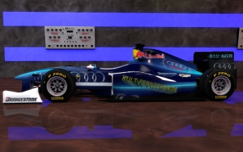
Mate, that is sick! No words about it. One thing I'd say is add a tiny touch of red on the rear wing endplates. Would do the job nicely.
Edit:
Mr Mullet:
With regard to your car, 1) Apologies for being late to this.
2) The number of sponsors you've got seems to create a cluttered feel to the whole car. It draws the attention away from the minimalistic design (which is good, minimal is always good).
As Dan said, there's nothing that looks good on the front wing supports except the old Bridgestone logo we had. Leave it blank or instead put a little flag on each side for your drivers. Eg. Australia on one side and another on the other side. Put a white stroke of 3 pixels on the inside.
The Pirelli logo on the red on the endplates of the front wing. Sorry but that just looks wrong. Go for white or instead just leave it blank since it is a primary partner.
The nose. Ohhh my... Remove all except pepsi, sap and pirelli and just keep it in the black spaces or have Pepsi and SAP in the black and pirelli in the red (for the primary partner effect). Ooo and for SAP, use their blue backed logo, it'll stand out well") .
.
The engine cover looks great over so top job on that. Only one thing, the Mercedes Benz logo, put it around the engine bits like McLaren do, it makes it look snazzier and keeps the top fin blank and flowing.
For the sides, I'd suggest the removal of all logos. Keep prince and that's it.
For the rear end plates, get rid of the flag and put it in the number itself like (ahem..) MPR in the Red days and my beloved DXR.. Just keep Sonax, Samsung and SAP on there all spaced around the wing. That's it.
I hope that's the kind of feedback you were looking for and if I've criticised and nit-picked too much (ask anyone here, I do it too much for my own good haha!), I apologise. Otherwise, keep up the good job because your base design is smashing!
Edited 1 time(s). Last edit at 05/01/2013 12:33AM by Monza972.
-------------------------------------------------------
> kedy89 Wrote:
> --------------------------------------------------
> -----
> > Incident 2k9 schrieb:
> >
> --------------------------------------------------
>
> > -----
> > > I'm so, so, tempted to show off my potential
> > > livery (just so nobody treads on my toes with
> > the
> > > white/dark grey colour scheme), but at the
> same
> > > time I wanna keep it under wraps...
> > >
> > > I'll give you all a little clue with it
> > > though...it has quite an interesting feature
> on
> > > the grey.
> >
> >
> > 50 shades?
>
> Touché! I'm afraid not though, it's a bit
> more...subtle.
>
> Screw it, I'll show y'all what I've made (feedback
> most certainly welcome):
>
> [i44.tinypic.com]
Mate, that is sick! No words about it. One thing I'd say is add a tiny touch of red on the rear wing endplates. Would do the job nicely.
Edit:
Mr Mullet:
With regard to your car, 1) Apologies for being late to this.
2) The number of sponsors you've got seems to create a cluttered feel to the whole car. It draws the attention away from the minimalistic design (which is good, minimal is always good).
As Dan said, there's nothing that looks good on the front wing supports except the old Bridgestone logo we had. Leave it blank or instead put a little flag on each side for your drivers. Eg. Australia on one side and another on the other side. Put a white stroke of 3 pixels on the inside.
The Pirelli logo on the red on the endplates of the front wing. Sorry but that just looks wrong. Go for white or instead just leave it blank since it is a primary partner.
The nose. Ohhh my... Remove all except pepsi, sap and pirelli and just keep it in the black spaces or have Pepsi and SAP in the black and pirelli in the red (for the primary partner effect). Ooo and for SAP, use their blue backed logo, it'll stand out well
.The engine cover looks great over so top job on that. Only one thing, the Mercedes Benz logo, put it around the engine bits like McLaren do, it makes it look snazzier and keeps the top fin blank and flowing.
For the sides, I'd suggest the removal of all logos. Keep prince and that's it.
For the rear end plates, get rid of the flag and put it in the number itself like (ahem..) MPR in the Red days and my beloved DXR.
. Just keep Sonax, Samsung and SAP on there all spaced around the wing. That's it.I hope that's the kind of feedback you were looking for and if I've criticised and nit-picked too much (ask anyone here, I do it too much for my own good haha!
), I apologise. Otherwise, keep up the good job because your base design is smashing! Edited 1 time(s). Last edit at 05/01/2013 12:33AM by Monza972.
Re: GPGSL S8 Round 11 - A1-Ring - Austrian Grand Prix - so call me, maybe. Date: April 30, 2013 11:32PM Posted by: JohnMaverick | Registered: 14 years ago |
Yeah Jake, that livery is honestly mind-blowing. You say you like the KFR? Well, I like yours right as much! I agree with Monil, though. A red stripe, maybe under the TOTAL logo at the rear wing would really serve the overall package.

GPGSL : Team Owner of 'Maverick Track Performance' (MTP)
GPGSL : Team Owner of 'Maverick Track Performance' (MTP)
Re: GPGSL S8 Round 11 - A1-Ring - Austrian Grand Prix - so call me, maybe. Date: April 30, 2013 11:37PM Posted by: Mullet345 | Registered: 11 years ago |
@Incident 2k9, liking the livery update. Looks good. But why change from HSBC to SanDisk for main sponsor?
@Ferrari2007, drop Mastercard and Pepsi? I suppose I can do that. As for removing the Mercedes logo from front wing supports, Christel have the Vauxhall logo there, so I thought I'd do the same with the Mercedes logo. I think it looks ok, but if I have to remove it then I'll do so. Shame I couldn't keep the first name of the drivers on the car where I had them originally. I still wanted to keep the names, so that's why the first name is on the rear wing. But I'll most likely remove the name to help make the rear wing look less cluttered. And engine, fuel and tyres are not final yet, so there's a chance they'll change by the time my team joins. I'll have a chance over the weekend to modify the livery once again, so once I finish that I'll post another update. Truecrysis suggested making my livery stand out more. How can I go about doing that?


@Ferrari2007, drop Mastercard and Pepsi? I suppose I can do that. As for removing the Mercedes logo from front wing supports, Christel have the Vauxhall logo there, so I thought I'd do the same with the Mercedes logo. I think it looks ok, but if I have to remove it then I'll do so. Shame I couldn't keep the first name of the drivers on the car where I had them originally. I still wanted to keep the names, so that's why the first name is on the rear wing. But I'll most likely remove the name to help make the rear wing look less cluttered. And engine, fuel and tyres are not final yet, so there's a chance they'll change by the time my team joins. I'll have a chance over the weekend to modify the livery once again, so once I finish that I'll post another update. Truecrysis suggested making my livery stand out more. How can I go about doing that?
Re: GPGSL S8 Round 11 - A1-Ring - Austrian Grand Prix - so call me, maybe. Date: April 30, 2013 11:45PM Posted by: Incident 2k9 | Registered: 15 years ago |
Ferrari2007 Wrote:
-------------------------------------------------------
> That's very cool Jake.
>
> Please please please put some sort of nose art on
> the side though. Like a red croc's nose, something
> like the Jordan cars had in the late 90s/early
> 2000s.
>
> That'd look so badass.
Damn, Dan, that's a sweet idea!
@Greg: I just didn't feel the HSBC logo suited the car as much. That said, I'm considering changing Sandisk as well...
Thanks for the kind words, chaps...I'll tweak a few little things and see what I can do with your feedback.
GPGSL: S6 - TafuroGP Tester (14th) /// S7 - ART Tester (6th) /// S8 - Demon Driver (13th) /// S9 - Demon/Snake Driver (13th) /// S10 - Snake Driver (???) ///]
"My ambition is handicapped by laziness" - Charles Bukowski
Re: GPGSL S8 Round 11 - A1-Ring - Austrian Grand Prix - so call me, maybe. Date: May 01, 2013 12:03AM Posted by: Ferrari2007 | Registered: 17 years ago |
Greg, I'm just giving some suggestions. I don't want to depart from what it is that you want on your livery. It's your team after all.
I consider the current MPR livery and those that have gone before it to be part of my identity amongst the series, even more so now that I've retired as a driver and my helmet has been shelved away.
If you keep taking my advice you'll end up with a white car with Martini stripes all over it
Jake, I'm not sure that the red on the rear wing endplates that has been suggested is really necessary. The lines on this car look great and a red flash would disrupt that in my opinion.
Races: 163 - Wins: 23 - Pole Positions: 24 - Fastest Laps: 22
Season 9: Constructors' Champions
Re: GPGSL S8 Round 11 - A1-Ring - Austrian Grand Prix - so call me, maybe. Date: May 01, 2013 12:06AM Posted by: oensan | Registered: 16 years ago |
Re: GPGSL S8 Round 11 - A1-Ring - Austrian Grand Prix - so call me, maybe. Date: May 01, 2013 12:15AM Posted by: Incident 2k9 | Registered: 15 years ago |
oensan Wrote:
-------------------------------------------------------
> Very nice! This is how the recent Saubers should
> have looked. Although I agree SanDisk could be
> changed for a company with a better logo
Yeah, I've canned Sandisk now...
Does anyone have any reasonable alternatives? I'm considering something alcohol-based...
GPGSL: S6 - TafuroGP Tester (14th) /// S7 - ART Tester (6th) /// S8 - Demon Driver (13th) /// S9 - Demon/Snake Driver (13th) /// S10 - Snake Driver (???) ///]
"My ambition is handicapped by laziness" - Charles Bukowski
Edited 1 time(s). Last edit at 05/01/2013 12:22AM by Incident 2k9.
Re: GPGSL S8 Round 11 - A1-Ring - Austrian Grand Prix - so call me, maybe. Date: May 01, 2013 12:34AM Posted by: Monza972 | Registered: 18 years ago |
Incident 2k9 Wrote:
-------------------------------------------------------
> oensan Wrote:
> --------------------------------------------------
> -----
> > Very nice! This is how the recent Saubers
> should
> > have looked. Although I agree SanDisk could be
> > changed for a company with a better logo
>
>
> Yeah, I've canned Sandisk now...
>
> Does anyone have any reasonable alternatives? I'm
> considering something alcohol-based...
Santilal Bakeries. Remember us for cakes and slowing other racers down!
Re: GPGSL S8 Round 11 - A1-Ring - Austrian Grand Prix - so call me, maybe. Date: May 01, 2013 12:39AM Posted by: JohnMaverick | Registered: 14 years ago |
Mullet345 schrieb:
-------------------------------------------------------
> @Incident 2k9, liking the livery update. Looks
> good. But why change from HSBC to SanDisk for main
> sponsor?
>
> @Ferrari2007, drop Mastercard and Pepsi? I suppose
> I can do that. As for removing the Mercedes logo
> from front wing supports, Christel have the
> Vauxhall logo there, so I thought I'd do the same
> with the Mercedes logo. I think it looks ok, but
> if I have to remove it then I'll do so. Shame I
> couldn't keep the first name of the drivers on the
> car where I had them originally. I still wanted to
> keep the names, so that's why the first name is on
> the rear wing. But I'll most likely remove the
> name to help make the rear wing look less
> cluttered. And engine, fuel and tyres are not
> final yet, so there's a chance they'll change by
> the time my team joins. I'll have a chance over
> the weekend to modify the livery once again, so
> once I finish that I'll post another update.
> Truecrysis suggested making my livery stand out
> more. How can I go about doing that?
You don't have to do anything. You asked for comments and that's what you get. Simple suggestions to things that one person thinks might look better. If you prefer something else, then go for it! It's your livery, after all.
What Connor meant with stand out more is what Jake has done with his livery. That is, bringing something unique. He went for this reptile grey, which is something unique and standing out. Other examples are the current TSM livery, with this star-themed grey. Or possibly other examples are two of my own:
The current KFR livery with its blue laser-beam optic: (click for bigger)
Or a first livery I painted for it also went for this reptile look: (click for bigger)

GPGSL : Team Owner of 'Maverick Track Performance' (MTP)
Edited 1 time(s). Last edit at 05/01/2013 12:47AM by JohnMaverick.
-------------------------------------------------------
> @Incident 2k9, liking the livery update. Looks
> good. But why change from HSBC to SanDisk for main
> sponsor?
>
> @Ferrari2007, drop Mastercard and Pepsi? I suppose
> I can do that. As for removing the Mercedes logo
> from front wing supports, Christel have the
> Vauxhall logo there, so I thought I'd do the same
> with the Mercedes logo. I think it looks ok, but
> if I have to remove it then I'll do so. Shame I
> couldn't keep the first name of the drivers on the
> car where I had them originally. I still wanted to
> keep the names, so that's why the first name is on
> the rear wing. But I'll most likely remove the
> name to help make the rear wing look less
> cluttered. And engine, fuel and tyres are not
> final yet, so there's a chance they'll change by
> the time my team joins. I'll have a chance over
> the weekend to modify the livery once again, so
> once I finish that I'll post another update.
> Truecrysis suggested making my livery stand out
> more. How can I go about doing that?
You don't have to do anything. You asked for comments and that's what you get. Simple suggestions to things that one person thinks might look better. If you prefer something else, then go for it! It's your livery, after all.
What Connor meant with stand out more is what Jake has done with his livery. That is, bringing something unique. He went for this reptile grey, which is something unique and standing out. Other examples are the current TSM livery, with this star-themed grey. Or possibly other examples are two of my own:
The current KFR livery with its blue laser-beam optic: (click for bigger)
Or a first livery I painted for it also went for this reptile look: (click for bigger)
GPGSL : Team Owner of 'Maverick Track Performance' (MTP)
Edited 1 time(s). Last edit at 05/01/2013 12:47AM by JohnMaverick.
Re: GPGSL S8 Round 11 - A1-Ring - Austrian Grand Prix - so call me, maybe. Date: May 01, 2013 01:12AM Posted by: Incident 2k9 | Registered: 15 years ago |
Huh, whaddya know? Maybe the HSBC logo DOES work...

GPGSL: S6 - TafuroGP Tester (14th) /// S7 - ART Tester (6th) /// S8 - Demon Driver (13th) /// S9 - Demon/Snake Driver (13th) /// S10 - Snake Driver (???) ///]
"My ambition is handicapped by laziness" - Charles Bukowski
Edited 1 time(s). Last edit at 05/01/2013 01:17AM by Incident 2k9.
GPGSL: S6 - TafuroGP Tester (14th) /// S7 - ART Tester (6th) /// S8 - Demon Driver (13th) /// S9 - Demon/Snake Driver (13th) /// S10 - Snake Driver (???) ///]
"My ambition is handicapped by laziness" - Charles Bukowski
Edited 1 time(s). Last edit at 05/01/2013 01:17AM by Incident 2k9.
Re: GPGSL S8 Round 11 - A1-Ring - Austrian Grand Prix - so call me, maybe. Date: May 01, 2013 01:39AM Posted by: Mullet345 | Registered: 11 years ago |
Re: GPGSL S8 Round 11 - A1-Ring - Austrian Grand Prix - so call me, maybe. Date: May 01, 2013 07:15AM Posted by: Mullet345 | Registered: 11 years ago |


Sorry, only registered users may post in this forum.
GP3 CarshapesGP3 CART & other CarsGP3 CART & other TracksGP3 CockpitsGP3 Editors / UtilitiesGP3 F1 CarsGP3 F1 TracksGP3 Fictional CarsGP3 Fictional TracksGP3 Graphics (Software Mode)GP3 HelmetsGP3 MiscGP3 Misc. GraphicsGP3 PatchesGP3 PitcrewsGP3 Season PackagesGP3 SetupsGP3 SoundsGP3 TeamartGP3 Trackgraphics
Maintainer: mortal, stephan | Design: stephan, Lo2k | Moderatoren: mortal, TomMK, Noog, stephan | Downloads: Lo2k | Supported by: Atlassian Experts Berlin | Forum Rules | Policy