Ferrari + Marlboro = Death...
Posted by DaiMOn
| Registered: 16 years ago |
I've just read this article (http://f1.gpupdate.net/en/formula-1-news/233362/doctors-calling-for-ferrari-marlboro-investigation/), and I don't know what is more ridiculous: The fact that the European Public Health Commissioner needed almost 5 years to figure it out what the BAR code means, or the fact that they made free advertisement for Philip Morris on the newspapers.
Marlboro can send a postcard for these idiots, if somebody wouldn't know what the bar code means, they realized now ! :D
Marlboro can send a postcard for these idiots, if somebody wouldn't know what the bar code means, they realized now ! :D
| Registered: 20 years ago |
| Registered: 19 years ago |
| Registered: 18 years ago |
| Registered: 18 years ago |
| Registered: 20 years ago |
| Registered: 16 years ago |
what a load of rubbish there is a quote that says something like " it resembles the barcode at the bottom of a packet" well ive looked around in shops and the barcode is not at the bottom of a bare marlboro packet , so i dunno what hes on about, also if he means the barcode thats scanned on a till then every package in the entire world has that on so in that respect ferrari could be advertising a pack of tampons or something :P

| Registered: 14 years ago |
| Registered: 20 years ago |
ipswich2007 Wrote:
-------------------------------------------------------
> what a load of rubbish there is a quote that says
> something like " it resembles the barcode at the
> bottom of a packet" well ive looked around in
> shops and the barcode is not at the bottom of a
> bare marlboro packet , so i dunno what hes on
> about, also if he means the barcode thats scanned
> on a till then every package in the entire world
> has that on so in that respect ferrari could be
> advertising a pack of tampons or something :P
Read it again - what he actually said is 'The bar code looks like the bottom half of a packet of Marlboro cigarettes'.
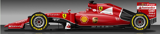
It does - the 'barcode' on the Ferraris has changed from what was on the '08' cars to something that, at speed, resembles the Marlboro logo that used to be on the cars. It's more blatant than whatever Jordan livery had 'Be on edge' as a non-tobacco livery, but spaced so that you could drop the remaining letters right back in.

Edited 1 time(s). Last edit at 04/30/2010 01:27PM by senninho.
-------------------------------------------------------
> what a load of rubbish there is a quote that says
> something like " it resembles the barcode at the
> bottom of a packet" well ive looked around in
> shops and the barcode is not at the bottom of a
> bare marlboro packet , so i dunno what hes on
> about, also if he means the barcode thats scanned
> on a till then every package in the entire world
> has that on so in that respect ferrari could be
> advertising a pack of tampons or something :P
Read it again - what he actually said is 'The bar code looks like the bottom half of a packet of Marlboro cigarettes'.
It does - the 'barcode' on the Ferraris has changed from what was on the '08' cars to something that, at speed, resembles the Marlboro logo that used to be on the cars. It's more blatant than whatever Jordan livery had 'Be on edge' as a non-tobacco livery, but spaced so that you could drop the remaining letters right back in.
Edited 1 time(s). Last edit at 04/30/2010 01:27PM by senninho.
| Registered: 16 years ago |
2 things i admit you are right that i read him wrong,
but nothing was more blatent than be on edge lool
ps i am a huge ferrari fan and have been since i was 10ish , even when it used to say marlboro i was never even tempted to pick up a pack anyway, so...
Edited 1 time(s). Last edit at 04/30/2010 05:11PM by ipswich2007.
but nothing was more blatent than be on edge lool
ps i am a huge ferrari fan and have been since i was 10ish , even when it used to say marlboro i was never even tempted to pick up a pack anyway, so...
Edited 1 time(s). Last edit at 04/30/2010 05:11PM by ipswich2007.
| Registered: 18 years ago |
| Registered: 19 years ago |
*Is* Ferrari going to drop Phillip Morris any time soon though? As silly as the news story is, it appears that the branding is now far too much for Australia - [news.bbc.co.uk]
It's not coming into force until 2012 but will Ferrari have to show horrific depictions of smoking-related illnesses on their cars at future Australian Grand Prix or something...?
It's not coming into force until 2012 but will Ferrari have to show horrific depictions of smoking-related illnesses on their cars at future Australian Grand Prix or something...?
| Registered: 20 years ago |
| Registered: 16 years ago |
| Registered: 20 years ago |
I does beg the question, when is a logo not a logo?
I mean... you can deconstruct it to kingdom come and back in the name of keeping things subtle, but at what exact stage do, say, the mcdonalds arches stop being the mcdonalds copyrighted logo?
I mean, what if you pixelised the entire thing to bare simplicity and boxes? We are talking an 8 x 8 chunky square grid.
And then a new company had a logo that resembled a very pixellated version of the mcdonalds logo? It is the mcdonalds on, pixellated, but is actually 64 pixel boxes of colour.
Where is the line drawn?
Very grey area this one, because if you remove so much of something, it doesn't really exist then. ie, breaking down the marlboro logo, what if it shared the same font with, say microsoft. It doesn't, but.. in terms of graphic images, colours etc...
What if marlboro and microsoft were the same text, and marlboro got graphically truncated to show just the two 'o's of the logo. They'd look the same. Letter 'o' *gap* Letter 'o'.
At what point does that stop being microsoft, and stop being marlboro? And do they equate to the same thing?
Does that make sense to anyone else, to be it is kinda hillarious. It is almost like you are trying to police the position of pixel locations.

Jenson drives it like he owns it; Lewis drives it like he stole it
I mean... you can deconstruct it to kingdom come and back in the name of keeping things subtle, but at what exact stage do, say, the mcdonalds arches stop being the mcdonalds copyrighted logo?
I mean, what if you pixelised the entire thing to bare simplicity and boxes? We are talking an 8 x 8 chunky square grid.
And then a new company had a logo that resembled a very pixellated version of the mcdonalds logo? It is the mcdonalds on, pixellated, but is actually 64 pixel boxes of colour.
Where is the line drawn?
Very grey area this one, because if you remove so much of something, it doesn't really exist then. ie, breaking down the marlboro logo, what if it shared the same font with, say microsoft. It doesn't, but.. in terms of graphic images, colours etc...
What if marlboro and microsoft were the same text, and marlboro got graphically truncated to show just the two 'o's of the logo. They'd look the same. Letter 'o' *gap* Letter 'o'.
At what point does that stop being microsoft, and stop being marlboro? And do they equate to the same thing?
Does that make sense to anyone else, to be it is kinda hillarious. It is almost like you are trying to police the position of pixel locations.
| Registered: 20 years ago |
danm schrieb:
-------------------------------------------------------
> I does beg the question, when is a logo not a
> logo?
> […]
>
> What if marlboro and microsoft were the same text,
> and marlboro got graphically truncated to show
> just the two 'o's of the logo. They'd look the
> same. Letter 'o' *gap* Letter 'o'.
>
> At what point does that stop being microsoft, and
> stop being marlboro? And do they equate to the
> same thing?
>
> Does that make sense to anyone else, to be it is
> kinda hillarious. It is almost like you are trying
> to police the position of pixel locations.
Reminds me of this:

Website | Blog | Twitter | CTDP: Site Blog Twitter
-------------------------------------------------------
> I does beg the question, when is a logo not a
> logo?
> […]
>
> What if marlboro and microsoft were the same text,
> and marlboro got graphically truncated to show
> just the two 'o's of the logo. They'd look the
> same. Letter 'o' *gap* Letter 'o'.
>
> At what point does that stop being microsoft, and
> stop being marlboro? And do they equate to the
> same thing?
>
> Does that make sense to anyone else, to be it is
> kinda hillarious. It is almost like you are trying
> to police the position of pixel locations.
Reminds me of this:
Website | Blog | Twitter | CTDP: Site Blog Twitter
| Registered: 20 years ago |
The graphic of the barcode must surely be copyrighted... So it is either copyrighted as a Marlboro logo or a Ferrari logo, and as far as law goes surely that is all?
----------------------------------------------------------------------------------------------------------------------------------------------------------------------------------------
The test of a first-rate intelligence is the ability to hold two opposed ideas in the mind at the same time, and still retain the ability to function. -- F.Scott Fitzgerald
| Registered: 19 years ago |
St.Hubbins Wrote:
-------------------------------------------------------
> The graphic of the barcode must surely be
> copyrighted... So it is either copyrighted as a
> Marlboro logo or a Ferrari logo, and as far as law
> goes surely that is all?
But they may have realised the loophole and not copyrighted it.


X (@ed24f1)
-------------------------------------------------------
> The graphic of the barcode must surely be
> copyrighted... So it is either copyrighted as a
> Marlboro logo or a Ferrari logo, and as far as law
> goes surely that is all?
But they may have realised the loophole and not copyrighted it.
X (@ed24f1)
| Registered: 20 years ago |
| Registered: 20 years ago |
SchueyFan schrieb:
-------------------------------------------------------
> St.Hubbins Wrote:
> --------------------------------------------------
> -----
>
> But they may have realised the loophole and not
> copyrighted it.
It is copyrighted by nature. Somebody created it, thereby it is copyrighted.
It may not have been trademarked, though.
Website | Blog | Twitter | CTDP: Site Blog Twitter

Sorry, only registered users may post in this forum.
GP3 CarshapesGP3 CART & other CarsGP3 CART & other TracksGP3 CockpitsGP3 Editors / UtilitiesGP3 F1 CarsGP3 F1 TracksGP3 Fictional CarsGP3 Fictional TracksGP3 Graphics (Software Mode)GP3 HelmetsGP3 MiscGP3 Misc. GraphicsGP3 PatchesGP3 PitcrewsGP3 Season PackagesGP3 SetupsGP3 SoundsGP3 TeamartGP3 Trackgraphics
Maintainer: mortal, stephan | Design: stephan, Lo2k | Moderatoren: mortal, TomMK, Noog, stephan | Downloads: Lo2k | Supported by: Atlassian Experts Berlin | Forum Rules | Policy