The 2014 Formula One Season
Posted by madotter
| Registered: 14 years ago |
| Registered: 10 years ago |
FORMULA PHALLUS.
Macca and Renault ain't so ugly now.. are they?
Sauber I can just about manage to look at. That STR though... looks like something you see at the back of Anne Summers. I wonder if it vibrates when the engine's running.
I'm pretty sure bulls have their dicks underneath, not on their face.
Macca and Renault ain't so ugly now.. are they?
Sauber I can just about manage to look at. That STR though... looks like something you see at the back of Anne Summers. I wonder if it vibrates when the engine's running.
I'm pretty sure bulls have their dicks underneath, not on their face.
| Registered: 12 years ago |
| Registered: 16 years ago |
thestig88 Wrote:
-------------------------------------------------------
> #HIDEOUS!
>
> sums up F1 though, how it allows itself to get
> into dumbass situations")
The rule makers don't seem to think anything through. Surely when they are thinking of the regulations there are some technically minded people amongst them who will be able to forecast what kind of hideous solutions the teams will come up with?
The noses this year are an abomination.
===================================================================================
Tahitian GP Circuit
[www.grandprixgames.org]
Easter Island Circuit
[www.grandprixgames.org]
-------------------------------------------------------
> #HIDEOUS!
>
> sums up F1 though, how it allows itself to get
> into dumbass situations
The rule makers don't seem to think anything through. Surely when they are thinking of the regulations there are some technically minded people amongst them who will be able to forecast what kind of hideous solutions the teams will come up with?
The noses this year are an abomination.
===================================================================================
Tahitian GP Circuit
[www.grandprixgames.org]
Easter Island Circuit
[www.grandprixgames.org]
| Registered: 20 years ago |

| Registered: 17 years ago |

| Registered: 20 years ago |
| Registered: 17 years ago |
| Registered: 20 years ago |
| Registered: 19 years ago |
| Registered: 16 years ago |
| Registered: 16 years ago |
| Registered: 19 years ago |
| Registered: 17 years ago |
| Registered: 20 years ago |
Leaving giant appendages aside for just a moment, the liveries thus far are leaving a little to be desired. Here's my take thus far in order of worst to best (based purely on paint jobs):
Force India - what a mess. Going black for black's sake, but retaining white highlights, with seeming no rhyme nor reason for the various splotches of green and saffron. They've gone from one of the better, more distinct liveries to undoubtedly the fuggliest.
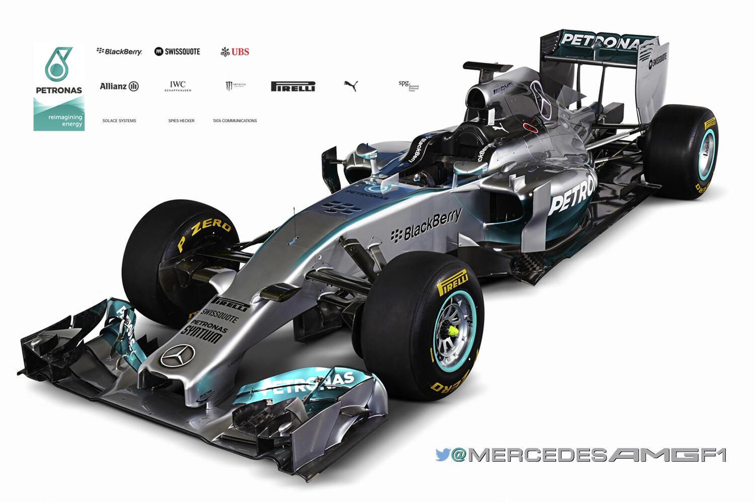
Mercedes - I like the flashes of turquoise high up on the nose, on the front wing and side pods. I like the giant shiny Merc tridents on the engine cover. But the random black stripe that shoots up at 45 degress randomly has got me beat. Where the hell did that come from and why the hell did that appear? Again, no rhyme nor reason for it.
Toro Rosso - it's become a bit of a staid look and feel for STR, but this car's proportions don't lend itself I believe to the rushing bull, and especially the swooping Red Bulls on the side pods. It just doesn't gel overall for mine. Treatment of the gold circle and bulls on the nose is poor.
McLaren - barely counts as a livery really, but the sleek plain chrome with black wings I don't mind although I probably wouldn't have eliminated red entirely as an accent colour around the nose and running up to the cockpit. I'd be amazed if it stays as sparse as the launch car through the season.
Sauber - now we're into the good liveries. Smart, simple, starting to create an identity for a team that has lacked one since the end of the BMW days. Solid, if not spectacular. The angled white and red flashes do seem to have a rhyme and a reason.
Red Bull - the epitome of maintaining 'brand image'. A look that I reckon in ten years will be as revered as red and white Mclarens, Ferraris with black wings and blue, white and yellow Williams. Love the yellow and bulls treatment to minimise the appearance on the nose.
Renault - I'm probably one of the few who actually like the red bits on the black and gold livery. It's a racier looking evolution of last year and I like it.
Ferrari - I'm not a Ferrari fan but got to say, I do like the change to have black at the back. I like that side on, it is straight, sharp lines that hit a distinct point, but viewed from any other angle the lines curve beautifully over the shape of the car - that angled point disappears.
Williams doesn't count as the livery we've seen so far is an interim testing paint job. I'm expecting good things from Caterham, and more of the same from Marussia.
What do you guys reckon?
Edited 1 time(s). Last edit at 01/28/2014 11:11AM by gareth.
Force India - what a mess. Going black for black's sake, but retaining white highlights, with seeming no rhyme nor reason for the various splotches of green and saffron. They've gone from one of the better, more distinct liveries to undoubtedly the fuggliest.
Mercedes - I like the flashes of turquoise high up on the nose, on the front wing and side pods. I like the giant shiny Merc tridents on the engine cover. But the random black stripe that shoots up at 45 degress randomly has got me beat. Where the hell did that come from and why the hell did that appear? Again, no rhyme nor reason for it.
Toro Rosso - it's become a bit of a staid look and feel for STR, but this car's proportions don't lend itself I believe to the rushing bull, and especially the swooping Red Bulls on the side pods. It just doesn't gel overall for mine. Treatment of the gold circle and bulls on the nose is poor.
McLaren - barely counts as a livery really, but the sleek plain chrome with black wings I don't mind although I probably wouldn't have eliminated red entirely as an accent colour around the nose and running up to the cockpit. I'd be amazed if it stays as sparse as the launch car through the season.
Sauber - now we're into the good liveries. Smart, simple, starting to create an identity for a team that has lacked one since the end of the BMW days. Solid, if not spectacular. The angled white and red flashes do seem to have a rhyme and a reason.
Red Bull - the epitome of maintaining 'brand image'. A look that I reckon in ten years will be as revered as red and white Mclarens, Ferraris with black wings and blue, white and yellow Williams. Love the yellow and bulls treatment to minimise the appearance on the nose.
Renault - I'm probably one of the few who actually like the red bits on the black and gold livery. It's a racier looking evolution of last year and I like it.
Ferrari - I'm not a Ferrari fan but got to say, I do like the change to have black at the back. I like that side on, it is straight, sharp lines that hit a distinct point, but viewed from any other angle the lines curve beautifully over the shape of the car - that angled point disappears.
Williams doesn't count as the livery we've seen so far is an interim testing paint job. I'm expecting good things from Caterham, and more of the same from Marussia.
What do you guys reckon?
Edited 1 time(s). Last edit at 01/28/2014 11:11AM by gareth.
| Registered: 20 years ago |


| Registered: 20 years ago |


| Registered: 16 years ago |
| Registered: 18 years ago |
Heh, I see what you mean, but I think it's just the flash.
As much as I said I disliked the Ferrari before, when it's out on track... wow, it looks aggressive.
In other news... I think I have a new all-time favourite looking car this is just freaking awesome!

--------------------------------------------------------------------------------
You know you want to. [judgegrudge.mybrute.com]
As much as I said I disliked the Ferrari before, when it's out on track... wow, it looks aggressive.
In other news... I think I have a new all-time favourite looking car
this is just freaking awesome!--------------------------------------------------------------------------------
You know you want to. [judgegrudge.mybrute.com]
| Registered: 12 years ago |
FI are an example of how to cover a bad nose ")
And having seen them on track, Ferrari looks no better, and most of the FI livery is a mess Merc and Red Bull look awesome though. I also have a soft spot for the STR (nose aside)
GPGSL -
GPGSL-3 - Pizza Party Racing manager and driver
Nations Cup - Team Scotland manager
Edited 1 time(s). Last edit at 01/28/2014 03:58PM by smoglessbutton4.
And having seen them on track, Ferrari looks no better, and most of the FI livery is a mess
Merc and Red Bull look awesome though. I also have a soft spot for the STR (nose aside) GPGSL -
GPGSL-3 - Pizza Party Racing manager and driver
Nations Cup - Team Scotland manager
Edited 1 time(s). Last edit at 01/28/2014 03:58PM by smoglessbutton4.


Sorry, only registered users may post in this forum.
GP3 CarshapesGP3 CART & other CarsGP3 CART & other TracksGP3 CockpitsGP3 Editors / UtilitiesGP3 F1 CarsGP3 F1 TracksGP3 Fictional CarsGP3 Fictional TracksGP3 Graphics (Software Mode)GP3 HelmetsGP3 MiscGP3 Misc. GraphicsGP3 PatchesGP3 PitcrewsGP3 Season PackagesGP3 SetupsGP3 SoundsGP3 TeamartGP3 Trackgraphics
Maintainer: mortal, stephan | Design: stephan, Lo2k | Moderatoren: mortal, TomMK, Noog, stephan | Downloads: Lo2k | Supported by: Atlassian Experts Berlin | Forum Rules | Policy